Case Study
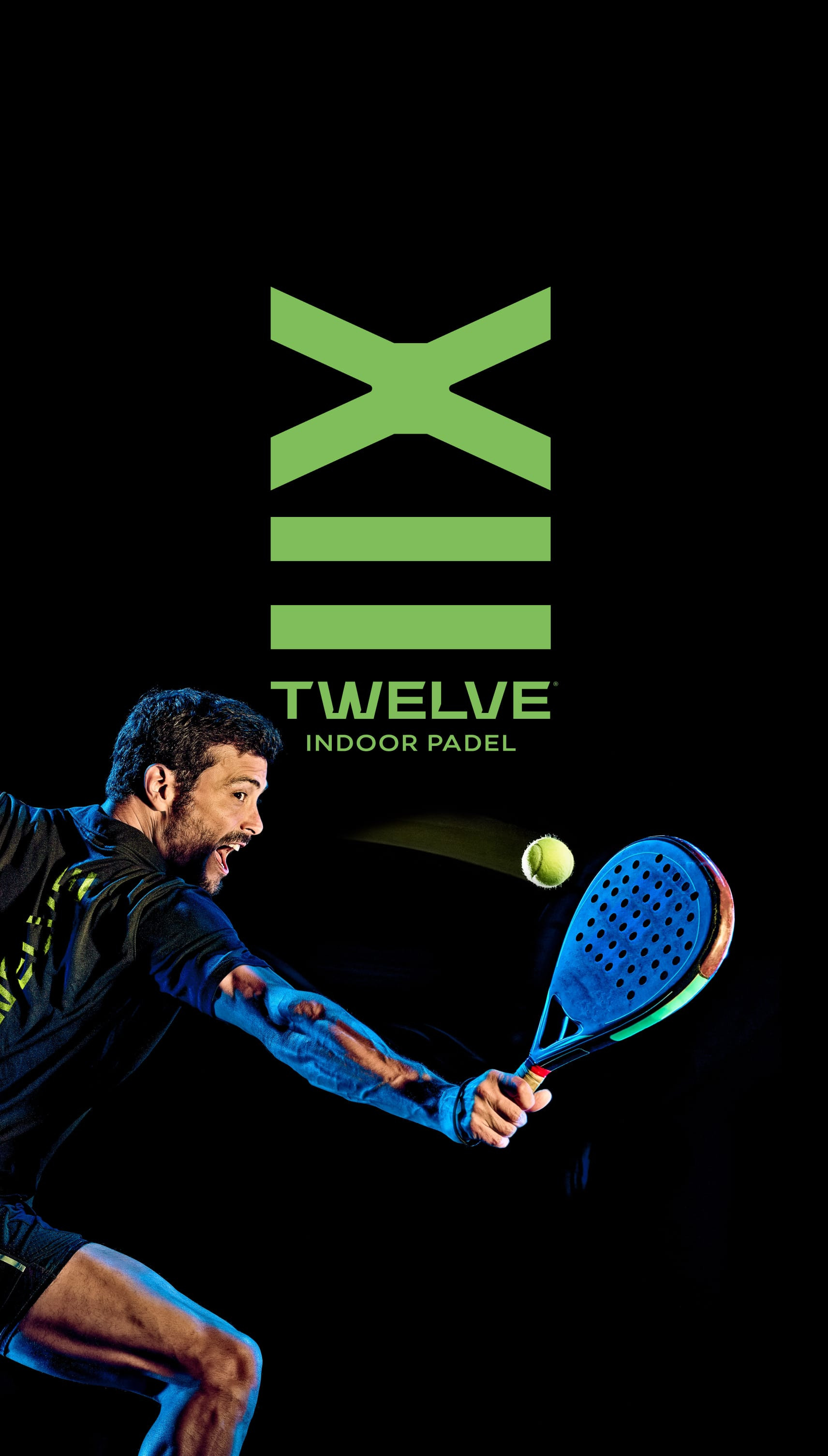
12 are the meters that elevate (your) game.
Three Padel lovers have come together to create a premium indoor complex south of the Tagus River. Shift was the agency responsible for the Club's Branding. This resulted in the earning of a statuette from the Lusophone Creativity Awards.

Padel south of the Tagus River.
As it is a team and social sport, Padel is probably one of the sports that recently has grown the most. And Montijo is one of the municipalities in the Lisbon metropolitan area with the highest growth in terms of new housing areas. Thus, taking advantage of the opportunity to have a space for the practice of the sport in a municipality of which a relevant expanse is accentuated, the Twelve Indoor Padel was born.
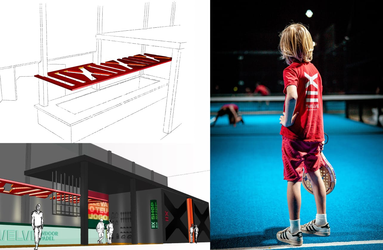
Twelve Indoor Padel clearly benefited from the status of the most recent indoor Padel complex south of the Tagus River, it distinguished itself by having one of the highest ceilings at a national level. Twelve are the meters, in height, that allow players to get the most out of the game. There are eight courts where they can do so.
Branding and Brand Signature to match!
The capacity to retain practitioners that Padel presents was, at the same time, an opportunity and a challenge. Opportunity because there was a market for Twelve; challenge due to the relationship that certain practitioners have with the clubs they already know.
The challenge was then to create a brand and signature that would allow the sport to be positioned and the club to be acknowledged in that area. For this to happen, it was essential to understand in depth the business, the target audience, with their behaviors and expectations, and the USP of Twelve Indoor Padel.
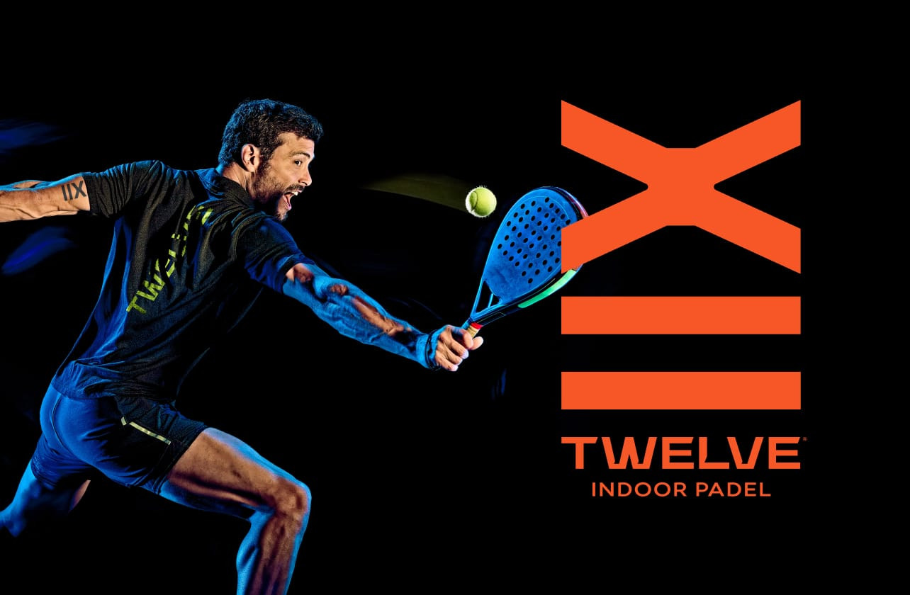
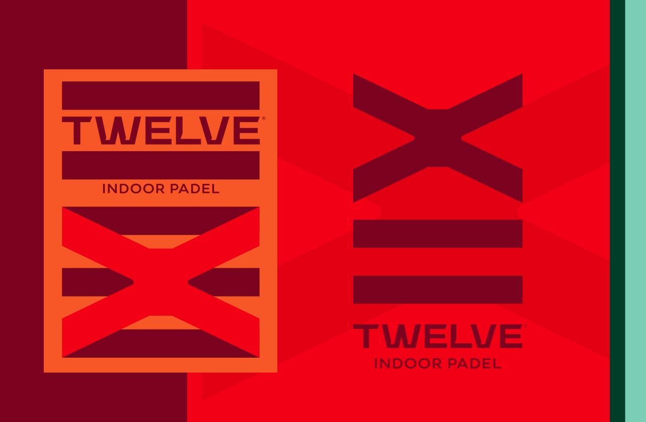
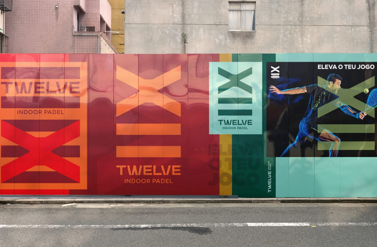
Twelve Indoor Padel, Elevate your game.
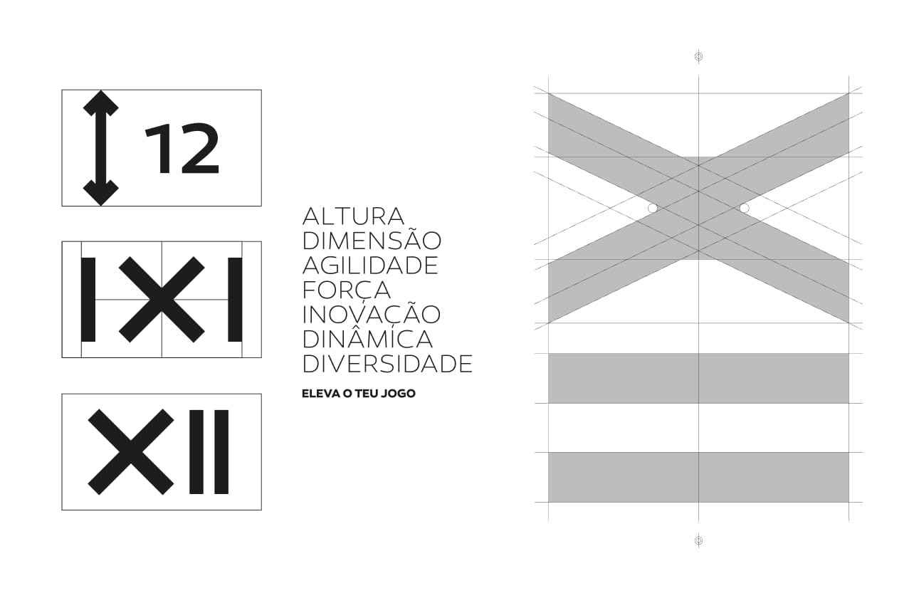
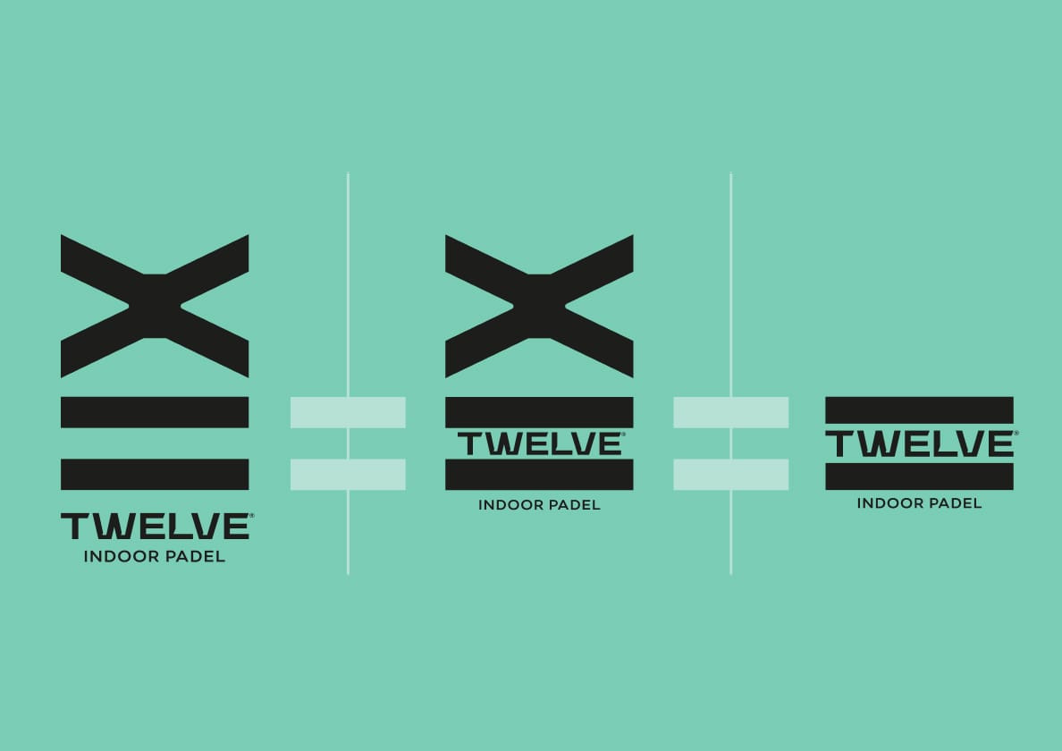
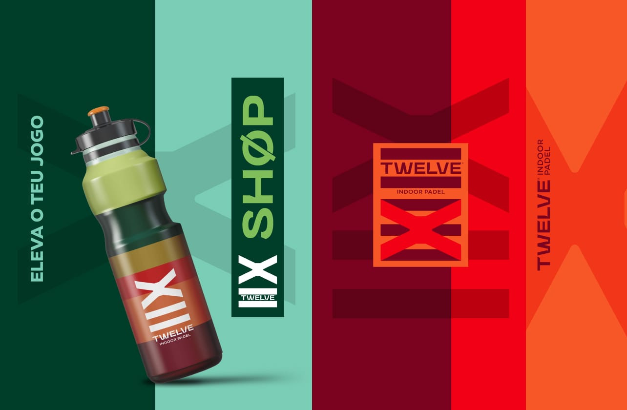
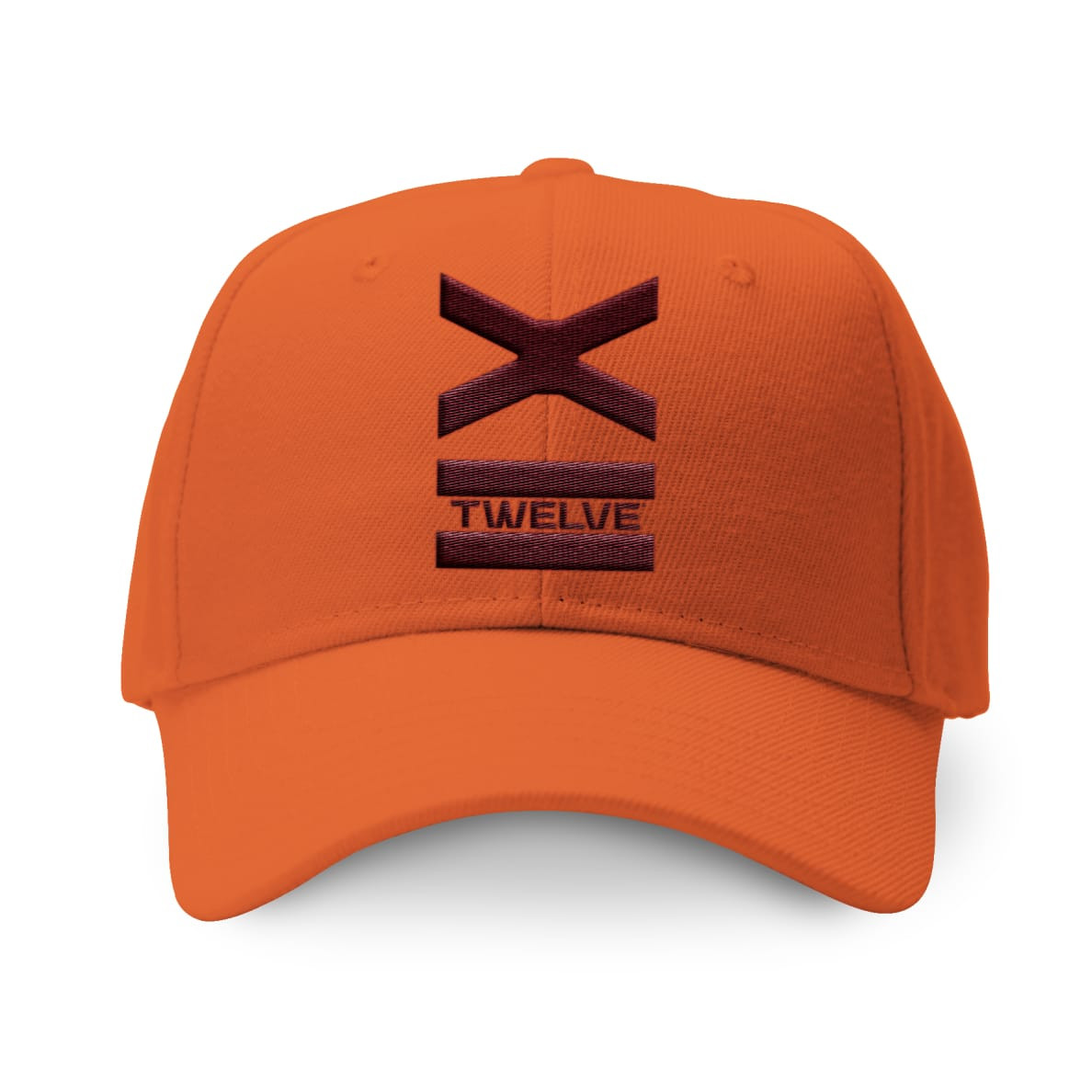
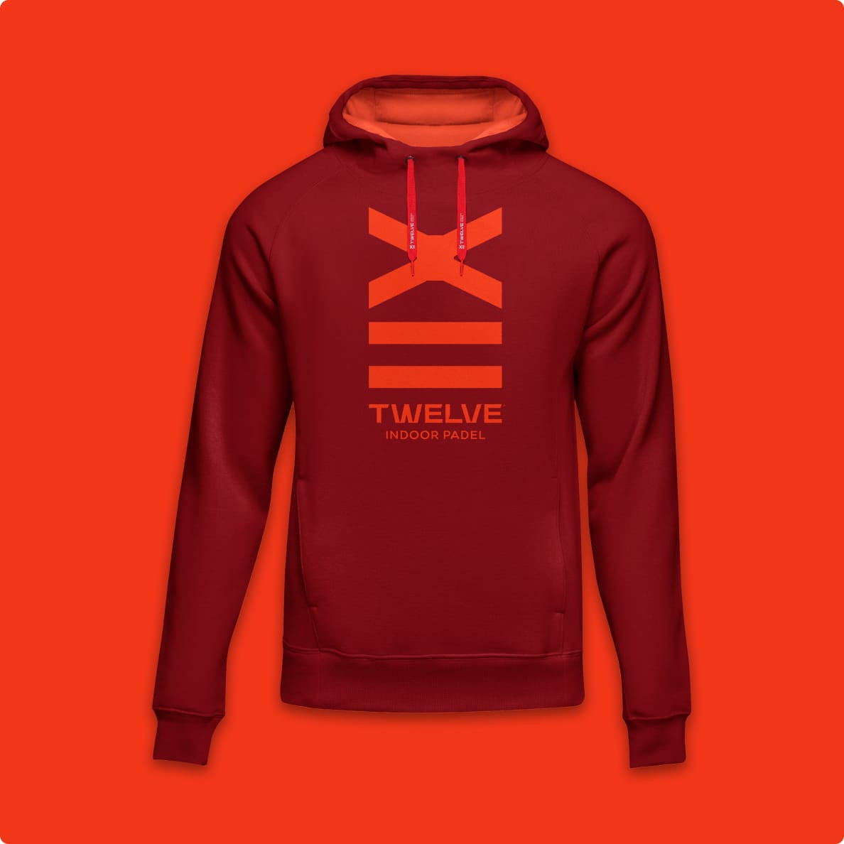
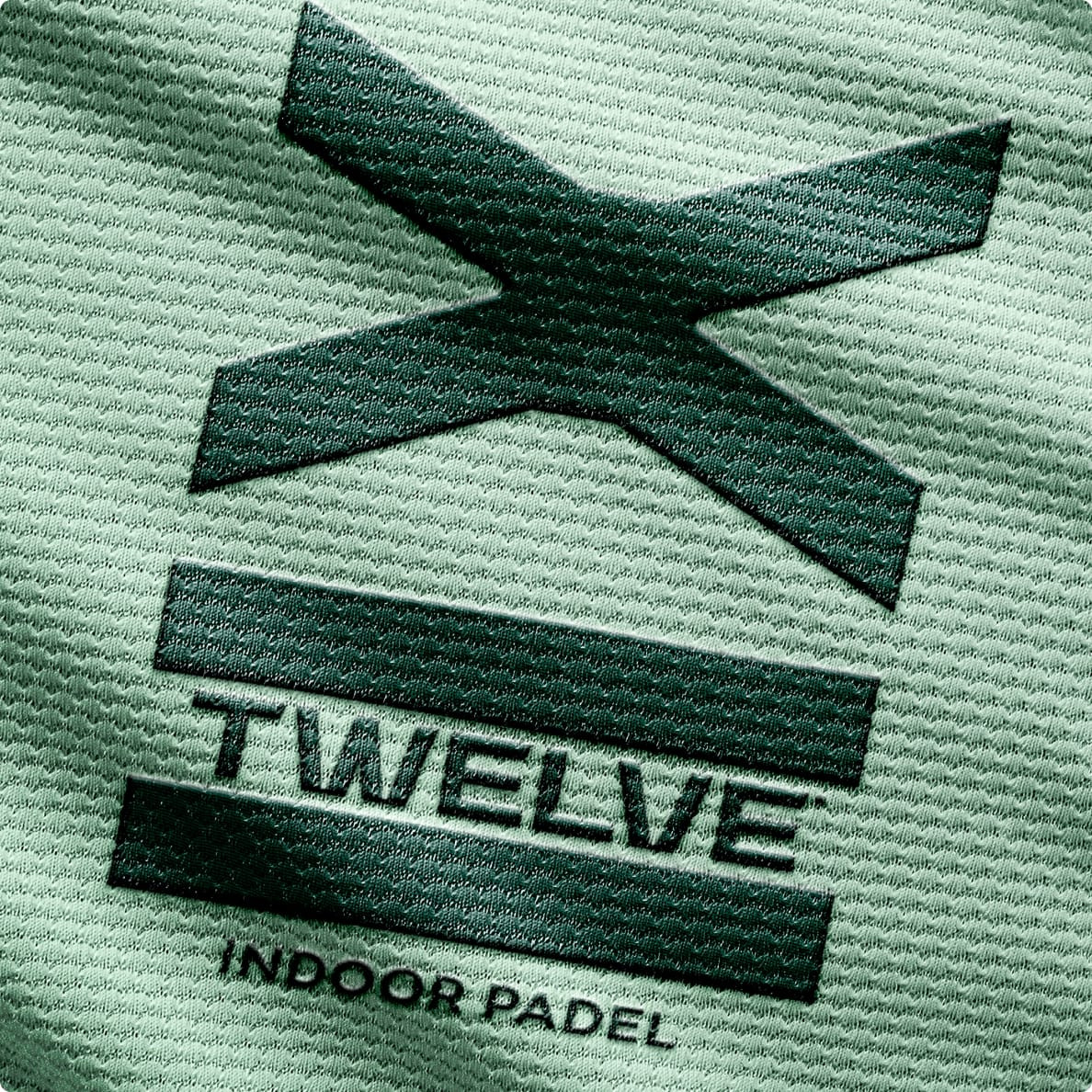
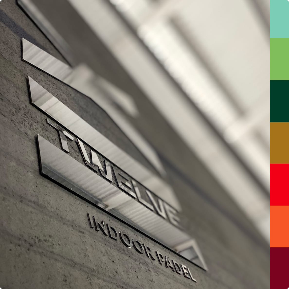
The logo is inspired by the height of the fields, with their 12 meters being represented in Roman numerals (XII), vertically. It is also influenced by the game's own movements, in which the four points of the "X" represent the four players and the dynamics of the game.
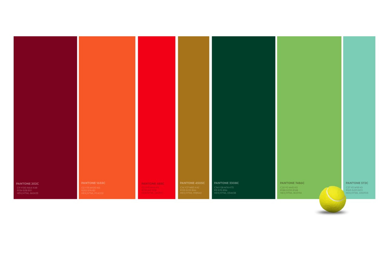
The chosen typography has small details that refer to the speed of Padel. The different colors of the chromatic palette reflect the diversity of audiences and levels of play of the target, since this is a club accessible to all lovers of the sport.
Height, size, agility, strength, dynamic innovation, diversity, were the keywords.
The signature is a reinforcement of the main distinguishing feature of these fields, subliminally referring to the 12 meters. At the same time that it refers to the magnitude of the space, the signature refers to the overall quality of the club, the WPT pitches or the technical staff or the facilities.
The project was distinguished by Lusophone Creativity Awards, having received the Bronze Award in the Design/Branding Category.
Summary
“Shift's immersion in the project and the business was fundamental, which, combined with the creativity of the team, made the result far exceed our expectations.”.
Filipe Araújo, Founder - Twelve