Case Study
Collaboration with producers to bring Alentejo Olive Oil closer to consumers were the objectives of the Alentejo Olive Oil Sustainability Program.
To achieve them, it was necessary to create the graphic identity, website and communication materials for the Program. And this was the responsibility of Shift.
For the sustainable future of Alentejo Olive Oil.
The Alentejo Olive Oil Sustainability Program (PSAA), is led by OLIVUM in partnership with the University of Évora. It has emerged with the mission of "... strengthening the image and value of olive oil produced in the Alentejo region, thus revealing it in a credible and transparent way. This, along with its sustainable production and its contribution to the environment, economy, society and culture of the region and the country."
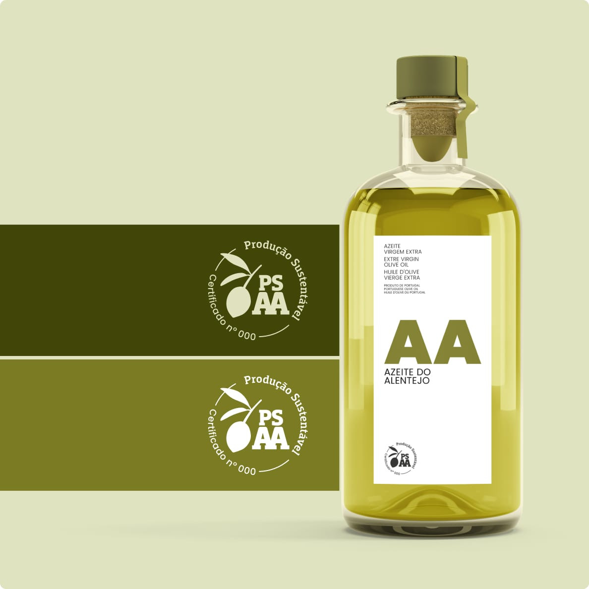
As a result of the cooperation and articulation of several producers, as well as the identification of a set of sustainable practices, the PSAA's ultimate objective is the creation of a sustainability benchmark. One that allows for the careful evaluation and certification of olive oil production in the region.
From a socioeconomic point of view, it is relevant to underline that in 2022 Portugal occupied the 6th position in the ranking of olive oil producers in the world. The country is also the 3rd largest exporter in the European Union. And 85% of the national olive oil is produced in the Alentejo region.
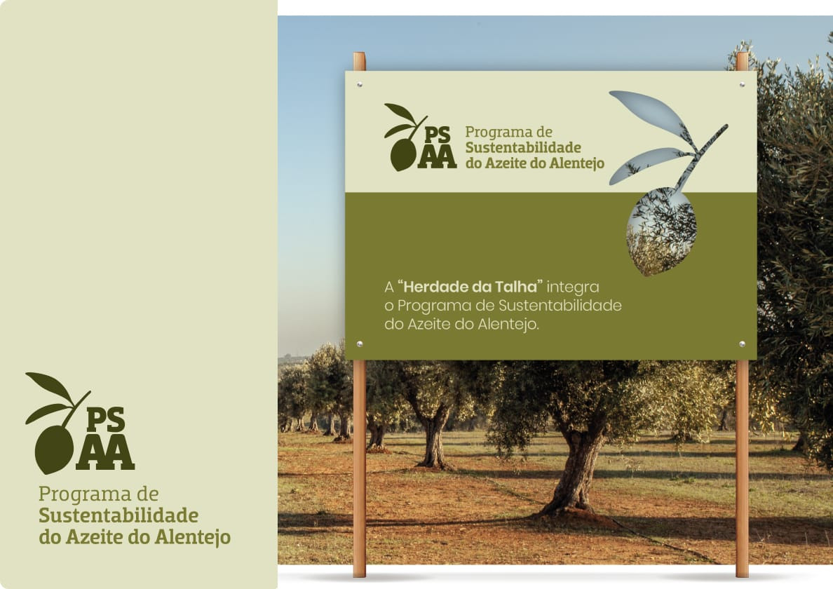
Branding (and not only) for the olive oil sector.
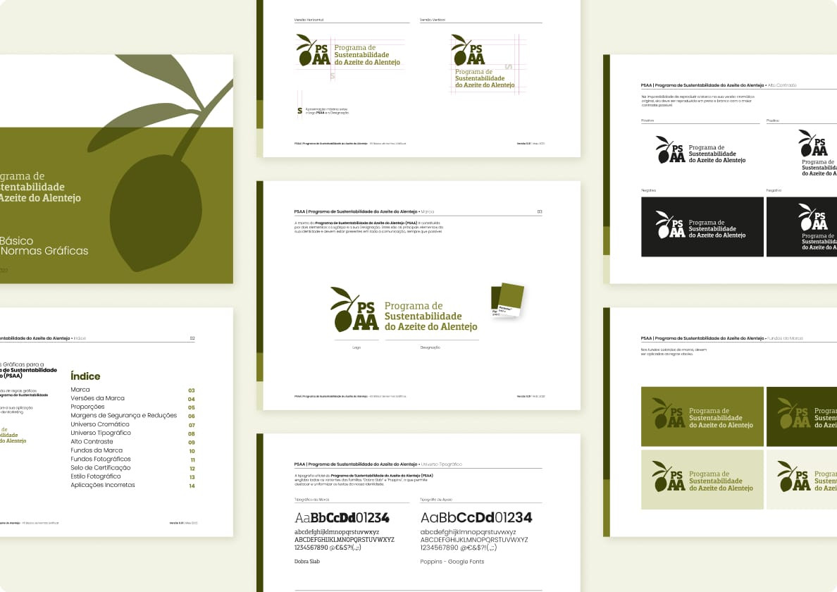
Shift was the creative agency responsible for creating the image of the PSAA. It has also developed the certification seal, website, signage and other digital pieces for the Program.
The goal of the project was to create a graphic identity that would allow it to communicate effectively with different target groups and types of stakeholders. On one hand, it was necessary to aim for B2B, since the PSAA depends on olive oil producers and mills. On another hand, it was also necessary to consider B2C, since the project aims to impact the community and public opinion.
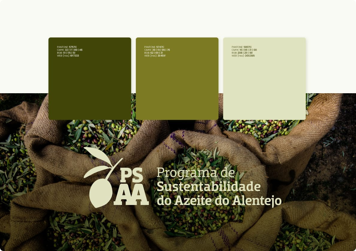
As far as identity was concerned, it was necessary to reconcile the graphic part with the message of sustainability. This, in order to make the identity versatile and elastic enough to respond to all the needs of the project, whether digital or physical.
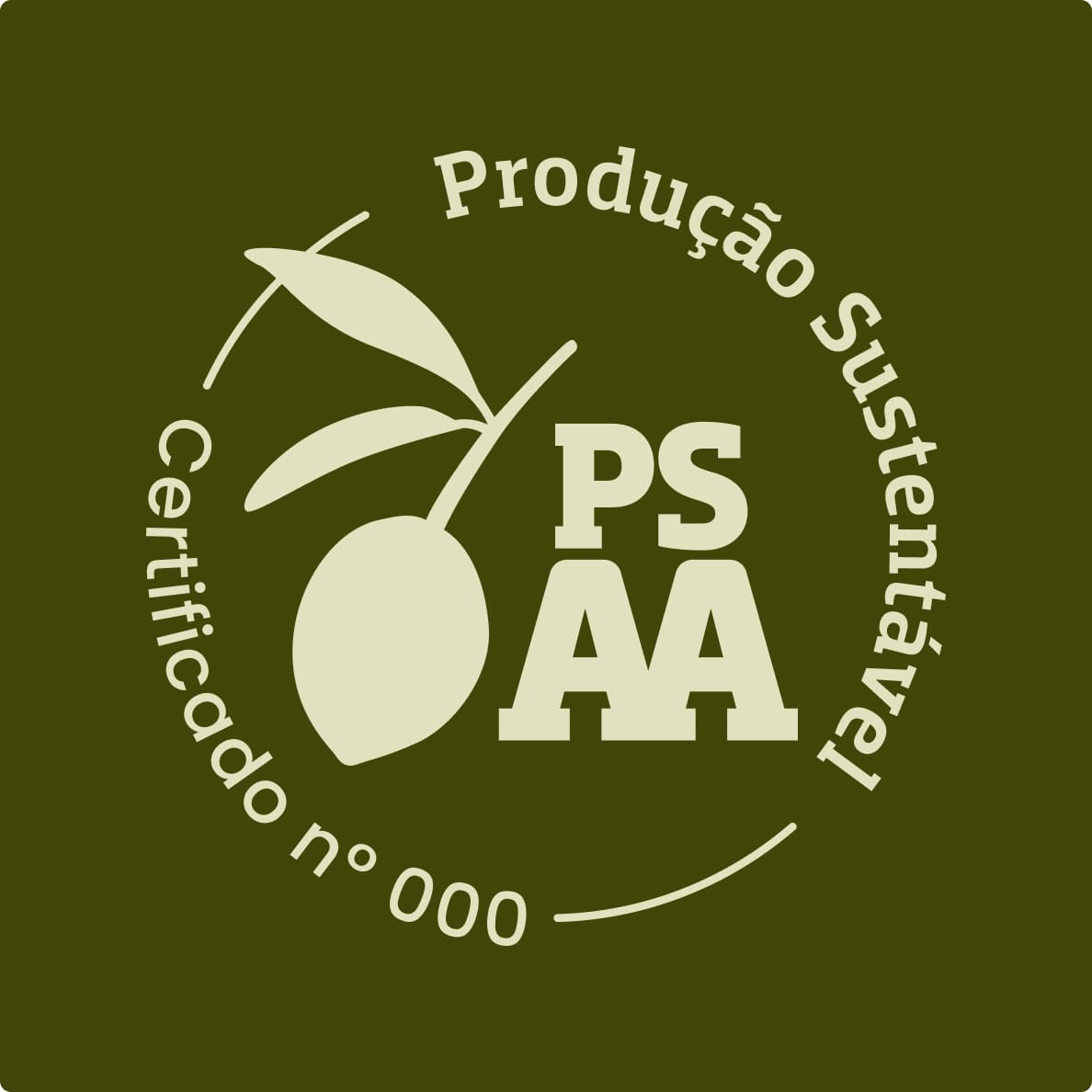
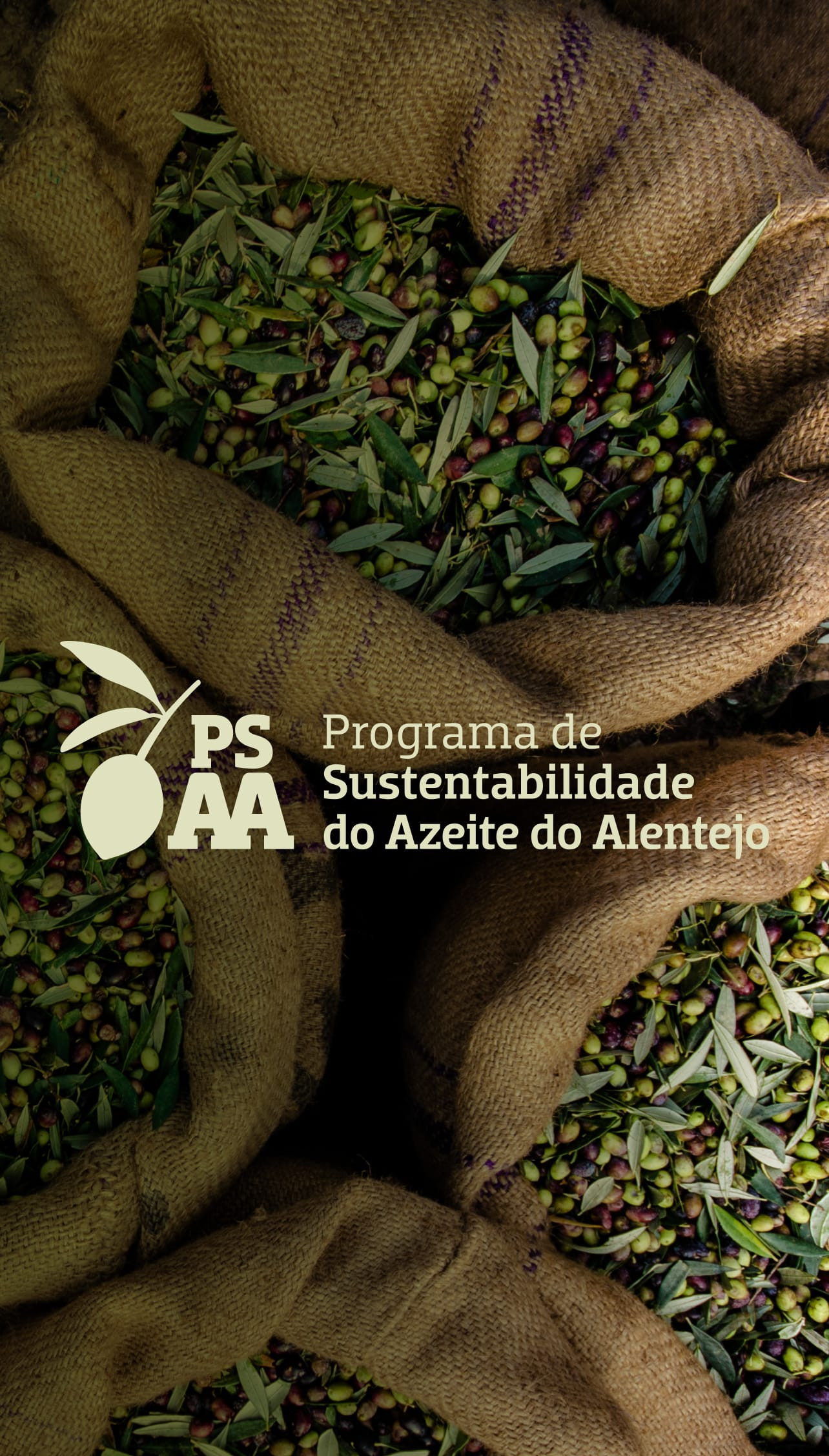
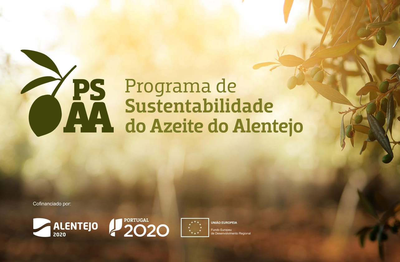
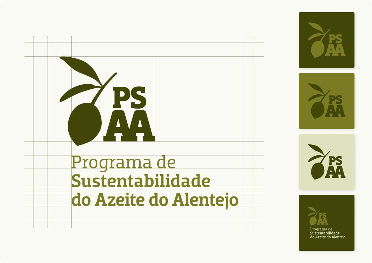
The Olive as a starting point for the graphic identity.
If the PSAA is a celebration of Alentejo Olive Oil - which not only adds value to the national economy, but also places Portugal in the world. We owe it to the Olive. This was the insight that originated the created logo.
Both the tribute to the Olive and the highlighting of the acronym seemed obligatory to us, since we wanted to facilitate the reading, verbal reference and identification of the Program.
The result is a harmonious identity, which blends colors and graphic elements that refer to the olive grove with the solidity and credibility of the chosen font.
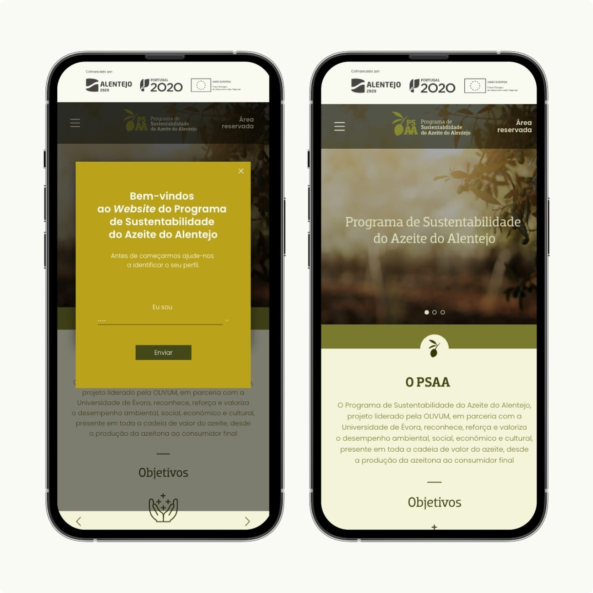
UX UI: The importance of mobile-friendly.
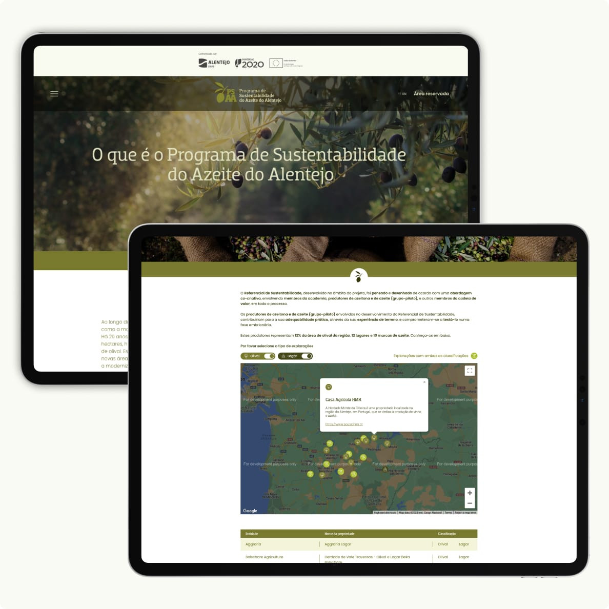
The website was built based on UX/UI best practices, with simple and accessible navigation, a well-defined information architecture and a color palette related to the olive sector..
Given the dominance of mobile traffic, the user experience on mobile devices was a priority. The overall performance of the website (result of content loading time, ease of reading, text formatting or design/size of CTAs) had to be as best on mobile as it was on desktop.
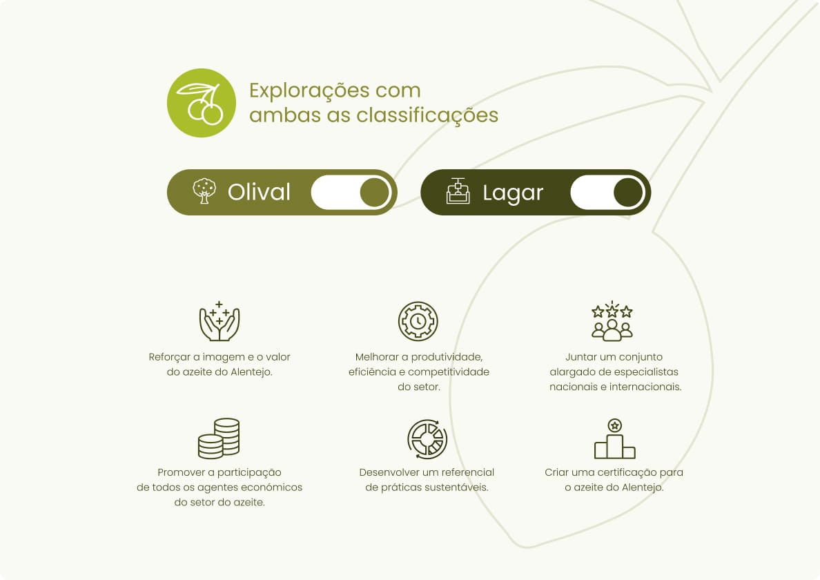
At the same time, an iconography was developed that on different pages of the website, is used in order to facilitate the decoding of the content. The result can be found here.